Over the years West African Civil Society Institute’s (WACSI) brand had been muddled with clunky, uninspired and archaic design motifs. There hadn’t been a singular design language over a period and that lead to a lack of an identifiable representation of the Institution.
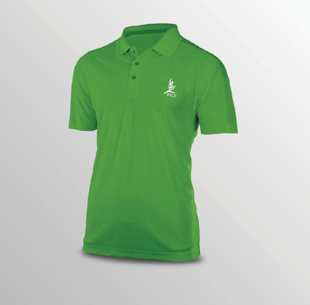
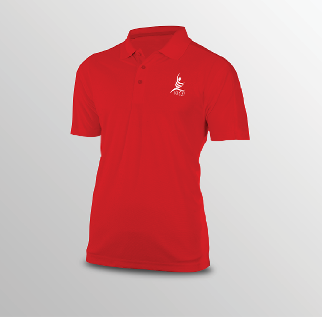
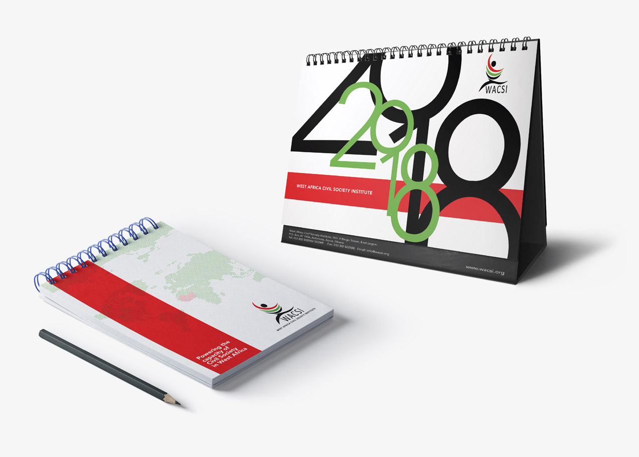
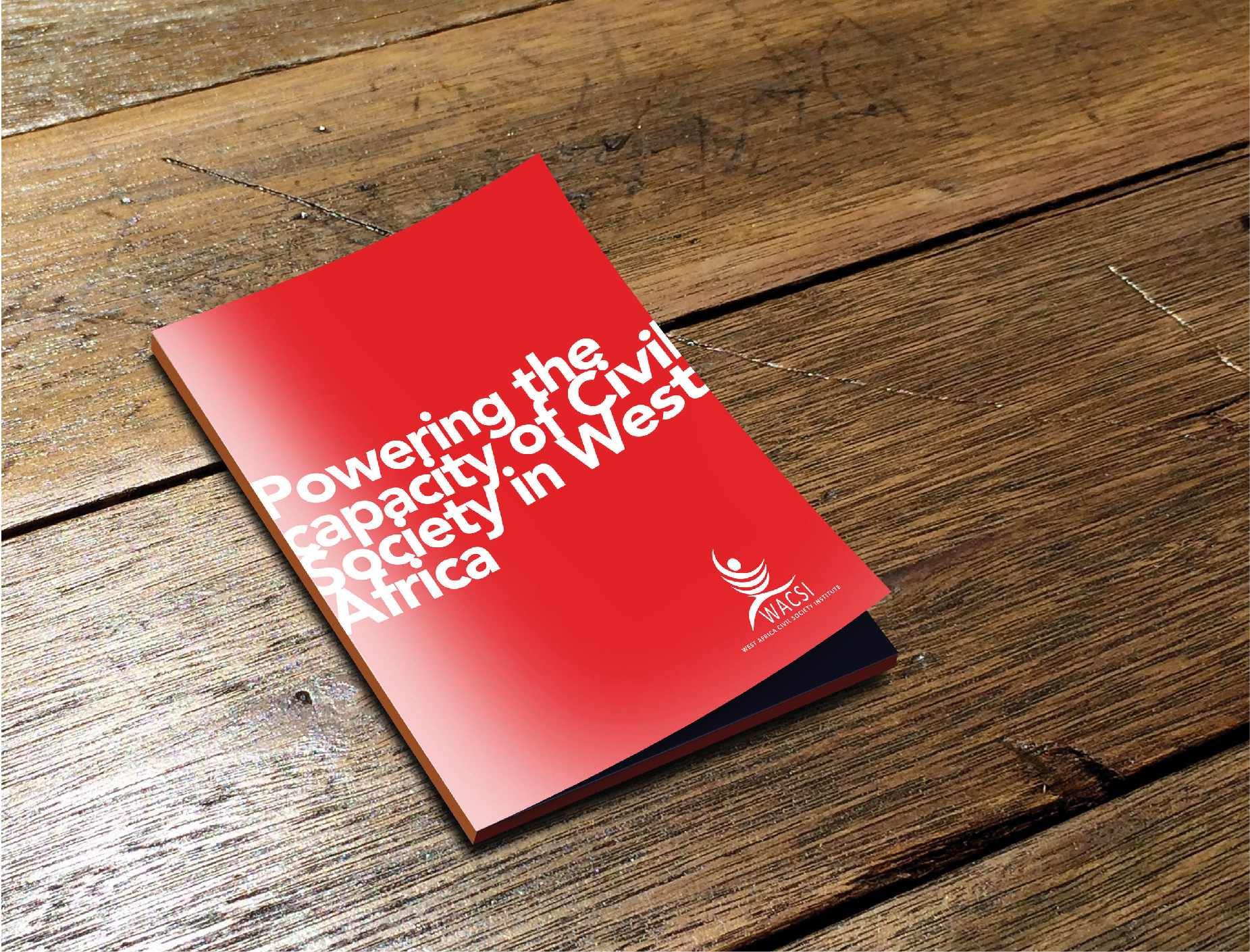
WACSI wanted designs for branded paraphernalia that were simple, minimalist and clean yet packing visual impact and amplifying the crucial mandate of the organization to all who encountered it.
Due to the unforgiving nature of their logo, they wanted designs that would find a way to bring modernity to an otherwise unseemly logo. WACSI wanted a good combination of angular and curved motifs that harmonized minimalism with elaboration.